GIAMPAOLO FLAMINI
HOME
2026®
CLIENT
SERIE A WOMEN
ROLE
Art Direction, Visual Identity
SERVICES
Brand Identity
Visual System
Logo Design
Digital Assets
Broadcast Graphics
The rebranding of Serie A Women was conceived to redefine the visual identity of the league and establish a bold, autonomous, and contemporary positioning within the professional football landscape.
The challenge was to create a strong and distinctive brand able to express competitiveness, ambition, and modernity, while supporting the rapid growth and visibility of women’s football at both a national and international level.
For this project, I worked on the development
of the visual identity, helping define a graphic language designed to support the league across broadcast graphics, digital platforms, and matchday communication.
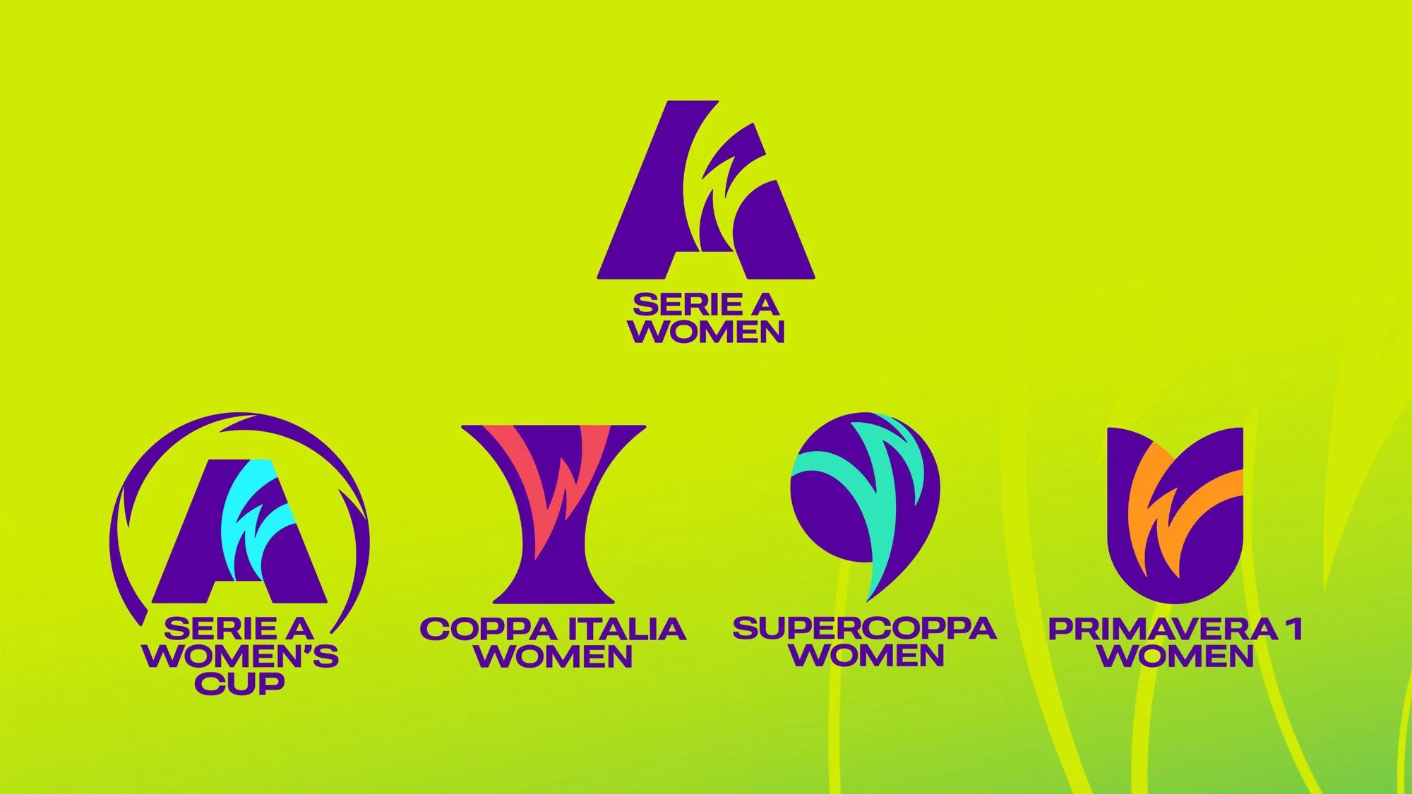
BRAND ARCHITECTURE
The new identity was developed as a unified system, extending the Serie A Women brand across all related competitions. A coherent family of logos was created for the Women’s Cup, Coppa Italia Women, Supercoppa Women, and Primavera 1 Women, ensuring consistency, recognizability, and a clear hierarchy within the league’s ecosystem.
IDENTITY SYSTEM
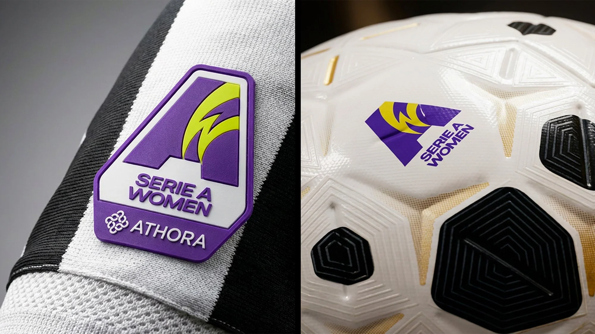
The new identity was built around a strong and distinctive “A”, conceived as both a symbol and
a system. Embedded within the mark, the “W” becomes the generative element from which the graphic texture is derived, transforming the logo into a dynamic visual language. This structure defines a solid core, while color and graphic variations allow the identity to adapt across competitions, platforms, and contexts without losing recognizability.
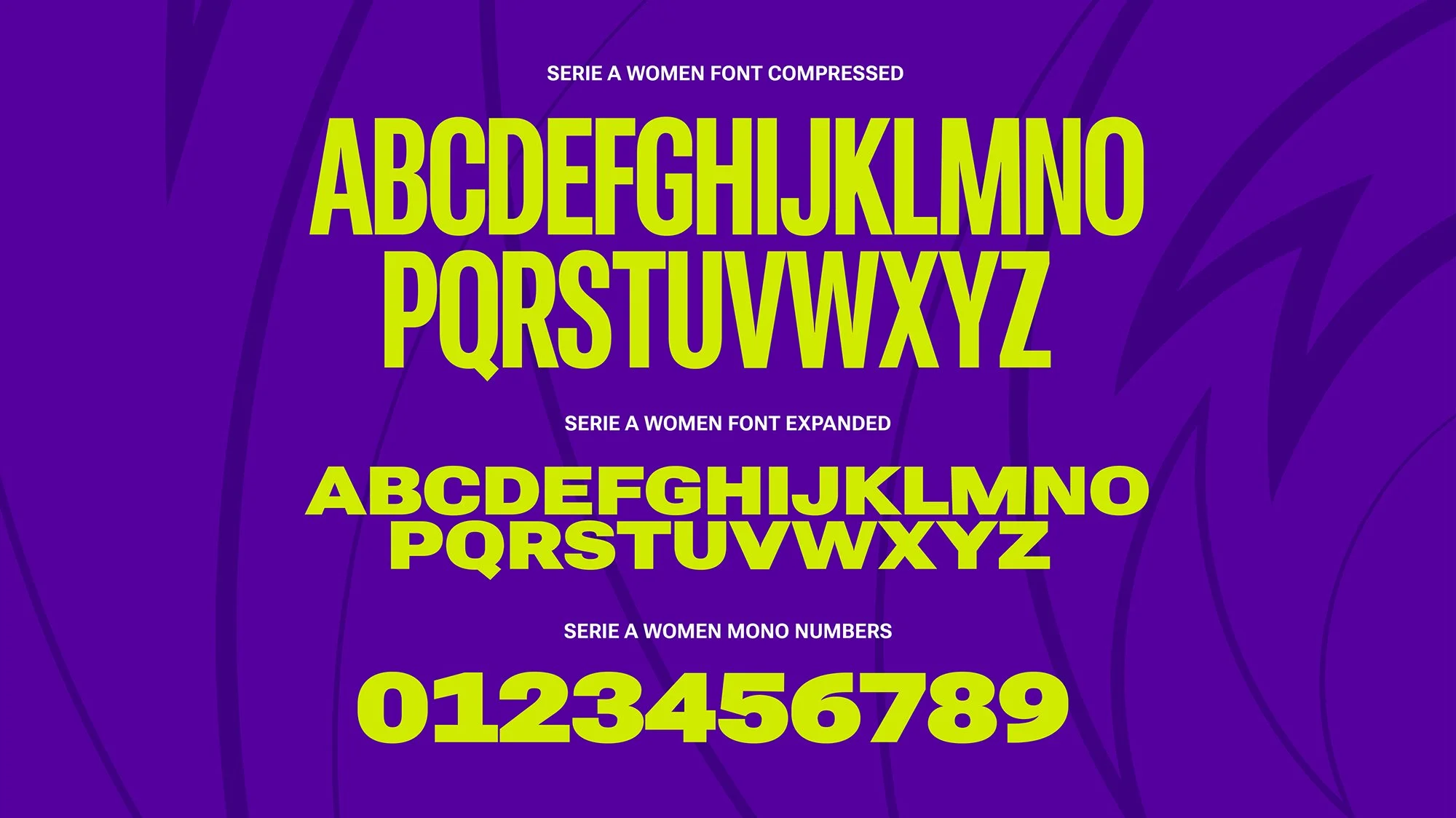
TYPOGRAPHY
Typography plays a key role within the identity, introducing a distinctive use of perspective as
a visual signature. The typographic system adds depth and movement, reinforcing the sense of energy and progression that defines the league.
This approach allows headlines and key messages
to stand out across digital, broadcast, and physical applications, making typography an active and recognizable element of the brand language.

MATCHGRAPHICS
The broadcast graphics were designed to translate the new identity into a clear, dynamic, and highly readable on-air language. Motion, typography, and color were optimized for live coverage, while the recurring “W” texture was subtly integrated into TV graphics as a distinctive visual layer. This element reinforces brand recognition across line-ups, lower thirds, and match graphics, enhancing the viewing experience throughout every moment of the game.
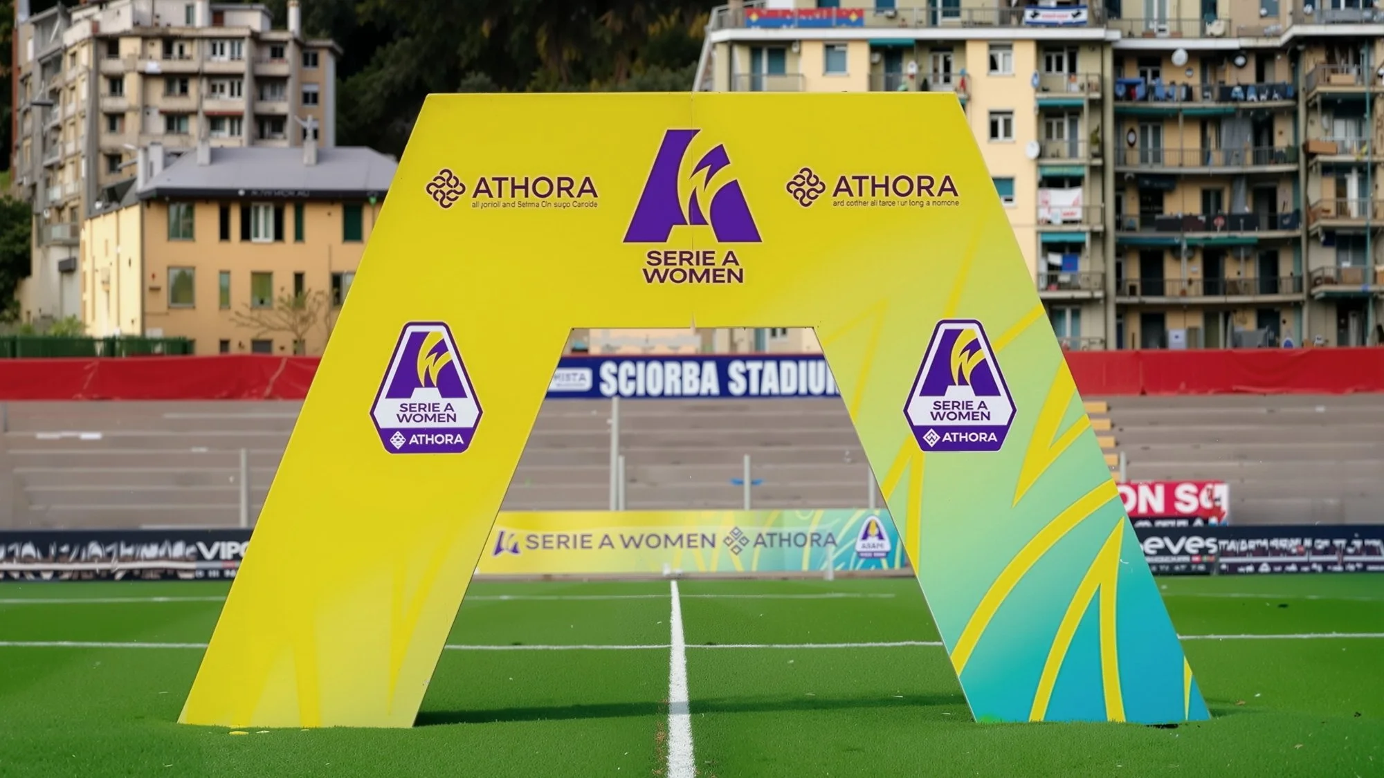
ON-FIELD AND PHYSICAL BRANDING
The identity was extended to all on-field materials, becoming an integral part of the matchday environment. From alignment arches and pitch-side elements to interview areas and stadium dressings, the visual system was designed to ensure clarity, consistency, and strong visibility.
These applications reinforce the Serie A Women brand directly on the field, where the competition takes shape and meaning.
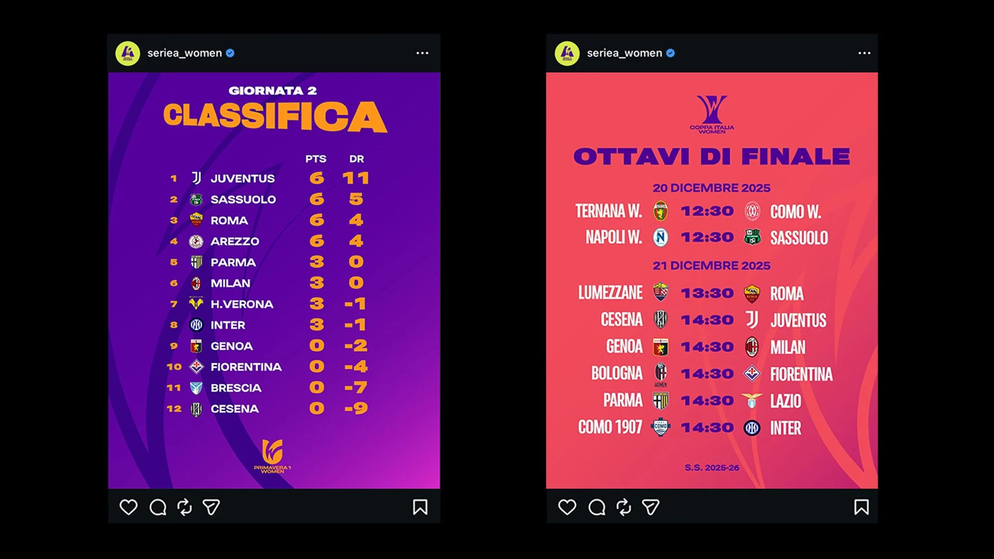
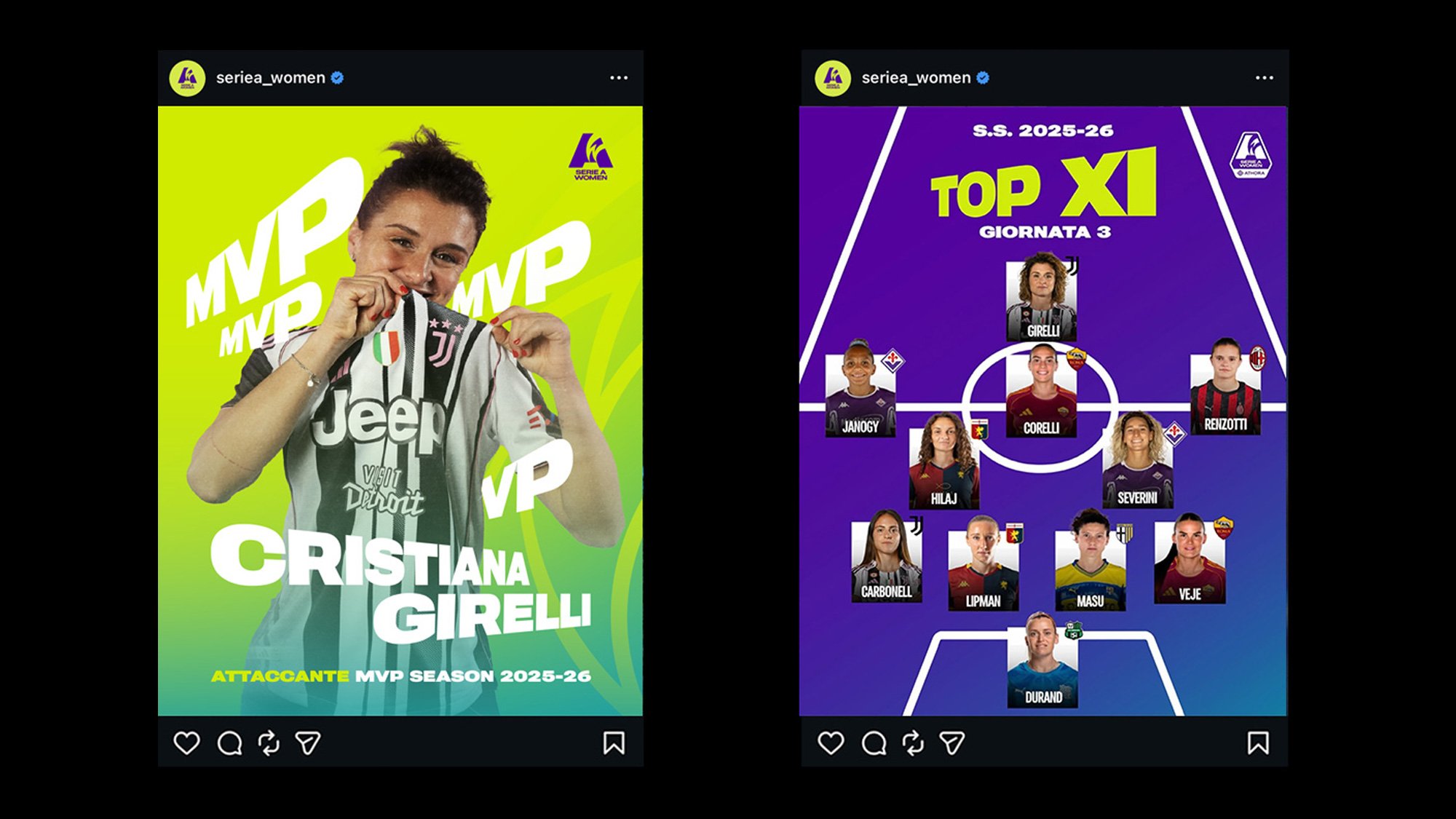
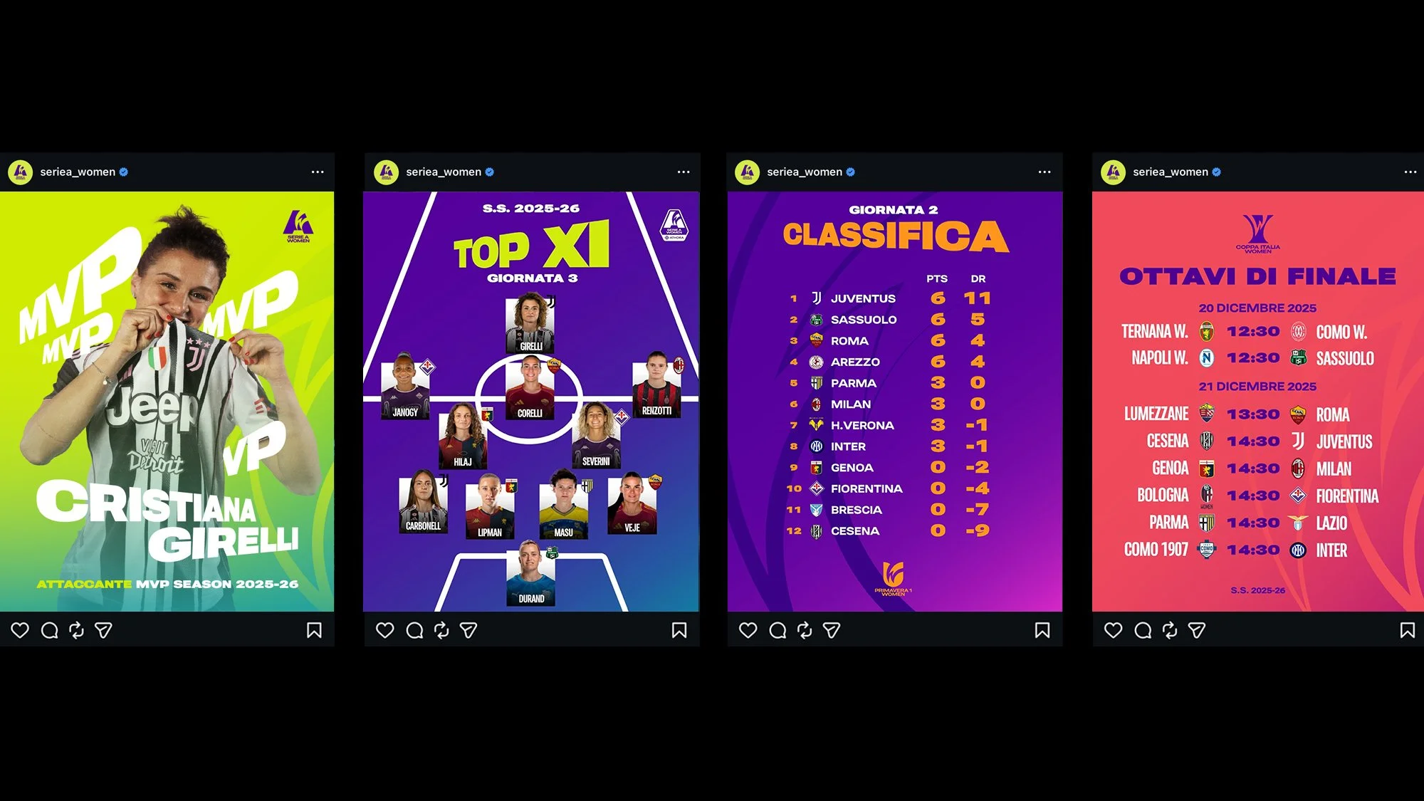
SOCIAL MEDIA VISUAL LANGUAGE
Social media became a primary space for the expression of the new identity. A flexible system
of templates was designed to support real-time match content, editorial formats, and competition updates, combining strong color contrasts, perspective typography, and clear hierarchies.
The visual language ensures immediate recognition within fast-moving feeds, allowing Serie A Women
to communicate with clarity, energy, and consistency across every post.