GIAMPAOLO FLAMINI
HOME↗
2026®
LEGA SERIE A
ART DIRECTION AND BRAND DESIGN
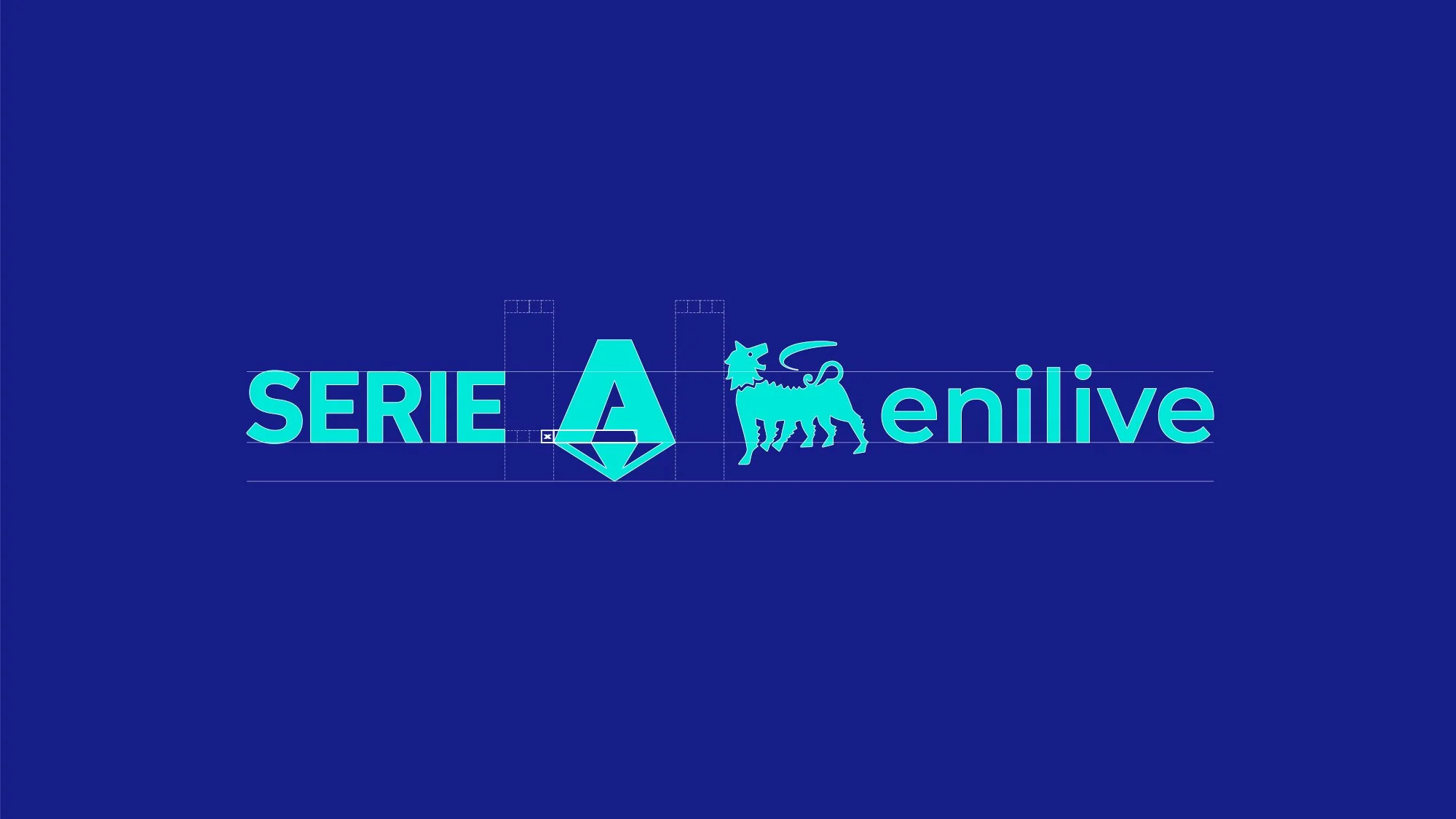
The Lega Serie A entrusted us with a comprehensive brand refresh aimed at renewing its visual identity without altering the institutional logo. The challenge was to give the League a more dynamic and contemporary presence while preserving
its authority and recognizability worldwide.
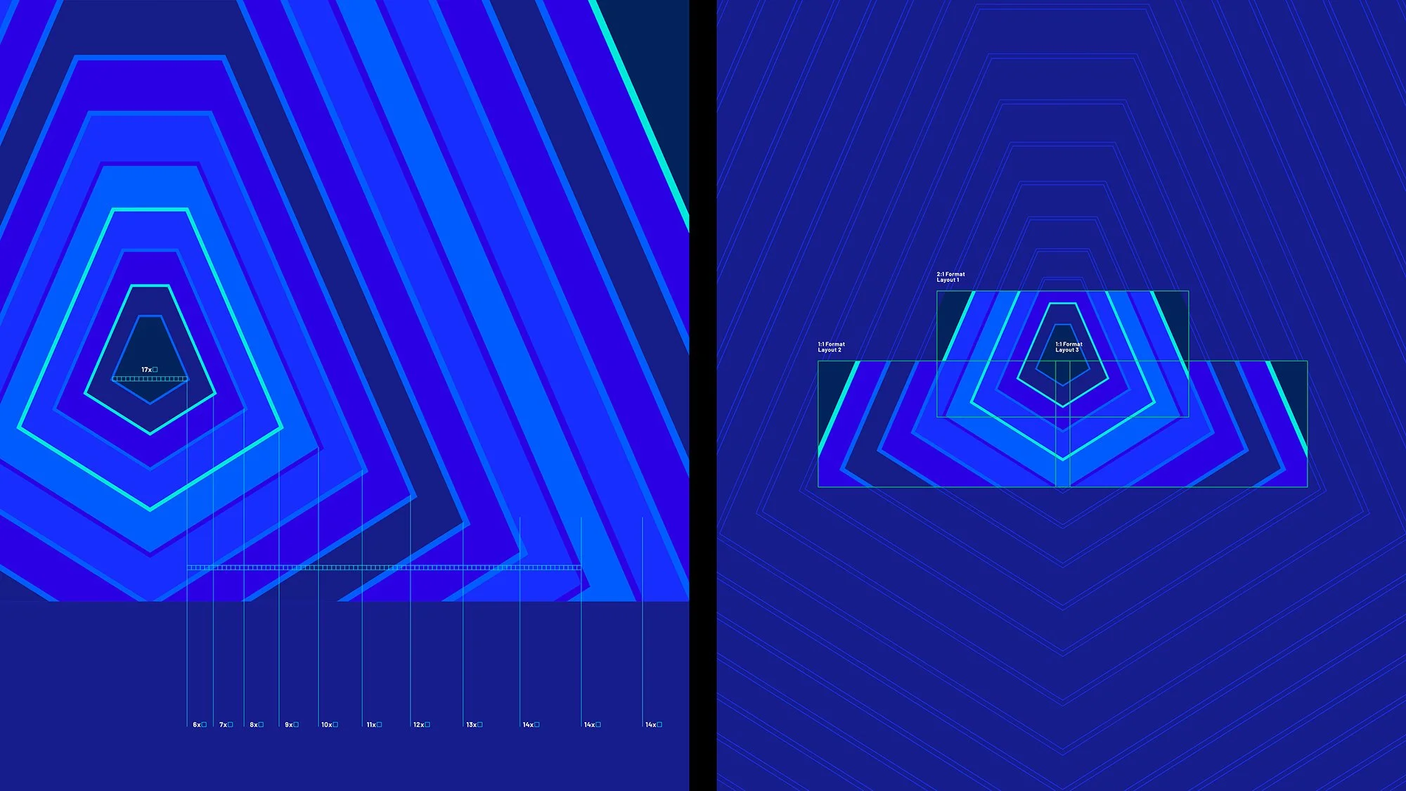
VISUAL SYSTEM REFRESH
We started by rethinking the graphic system. New textures and visual devices, inspired by the “A”, were designed to bring energy and coherence across all touchpoints. These patterns became the backbone of the refreshed identity and were consistently applied not only to Serie A but also to all related competitions — Coppa Italia, Supercup, eSerie A, and the Primavera championship — creating a unified and instantly recognizable family of brands.
MATCHGRAPHICS
The television package was one of the core areas of intervention. Scoreboards, lower thirds, and motion graphics were redesigned with a sharper, modern style. The result was a more engaging experience for viewers, both in Italy and abroad, where Serie A broadcasts reach millions every week.
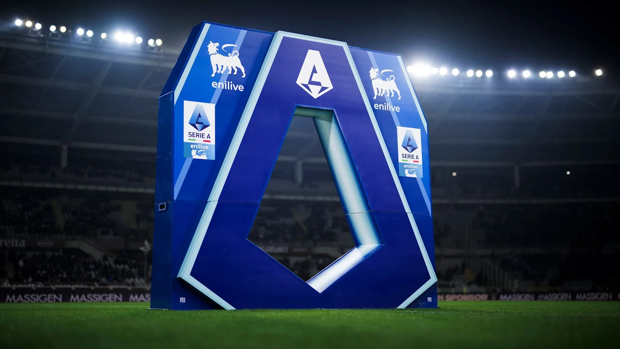
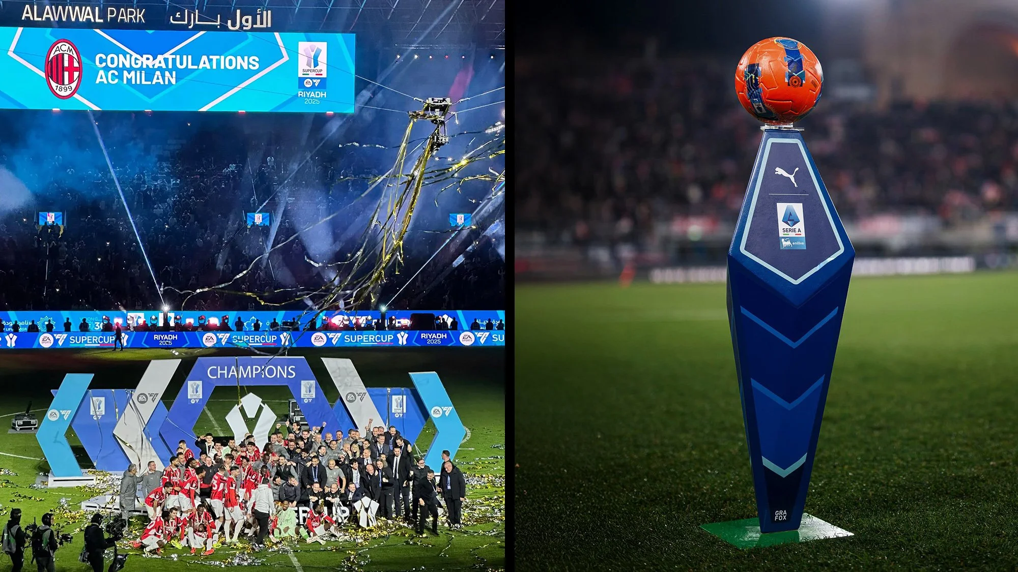
ON-FIELD AND PHYSICAL BRANDING
On the field, consistency was key. From interview backdrops to player tunnels, from benches to LED boards, every element was aligned with the new visual language. This ensured a uniform look that elevated the matchday environment.
SOCIAL MEDIA VISUAL LANGUAGE
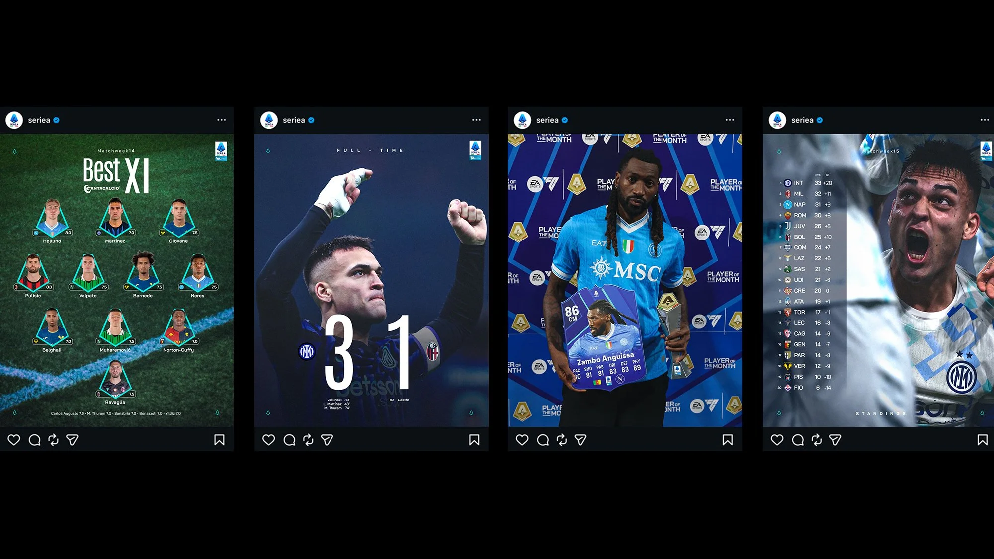
Digital and social platforms were designed as primary touchpoints. A flexible set of visual templates allows the League to produce real-time match content, live updates, and campaigns with speed and consistency, ensuring immediate recognition within fast-moving social feeds.